Archive
This post is archived and may contain outdated information. It has been set to 'noindex' and should stop showing up in search results.
This post is archived and may contain outdated information. It has been set to 'noindex' and should stop showing up in search results.
Web Design Image File Size Optimization Guide
Feb 8, 2012Web DevelopmentComments (0)
 Reducing the file size of the images used in your web design can improve loading speeds, which will keep some visitors from leaving prematurely, and can reduce the load and bandwidth usage on your server. Large reductions in file size can be achieved by selecting the right format and quality, and taking the time to optimize each and every image that your design uses, no matter the size. I'm going to cover how to reduce the file size of both JPG and PNG images, and how you can do it without sacrificing the clarity of your images.
The first step in optimizing your images is to decide which format to use. JPG is generally the best for real-life pictures and complex scenes. It significantly reduces the file size at the expense of introducing artifacts. These artifacts are generally unnoticed in complex scenes or gradients, but can be quite noticeable on hard edges and solid colors.
PNG is the best for images with many areas of solid colors, images that contain few overall colors, and images that need transparency. They can be lossless as long as the number of colors encompasses all of the colors used in the original image. On complex scenes or real-life photos, these formats can lead to very large file sizes.
I should also note that most of the optimizations used for PNG can also apply to GIF, though GIF will not be covered directly.
Optimizing PNGs
Most of your web design's component images should be PNG, so we'll start here. Depending on your image editing program, you may have options such as PNG-8 and PNG-24. PNG-8 can use up to 256 colors (2^8), and you can often specify exactly how many and what colors to use. This is where you can see the most file size benefit. PNG-24 can use over 16 million colors (2^24) and is useful in some instances where its compression ratio will be better or you need more than 256 colors.
When exporting a background image, try reducing the number of colors and see what effect it has on the image (your program should offer some sort of image and file size preview). You may want to zoom in to 400% or more so you can really see the changes. Colors that are very close can usually be made the same with little or no change in how the image looks. Try reducing the number of colors an image requires as much as possible.
Here is an example of the H3XED logo with no compression. It is enlarged 800% for display purposes. At normal size and saved as PNG-24, it is 3,227 bytes:

Many of the colors can be consolidated to reduce the file size, and since the logo sits over top of a tiled background, the blue gradient background can be removed entirely from the logo and transparent pixels left in their place (Photoshop "Difference" mode helps to do this). Some of the colors that are only marginally different than the background can also be deleted.
Optimizing the image takes some time. I go through and use the Magic Wand tool in Photoshop, with tolerance set to 1 and anti-aliasing and contiguous off (so I can select all of a single color in the image). I replace colors with similar colors that are used elsewhere, remove bits of the shadowing entirely, and in general clean up the logo. Next, I save it as a PNG-8 with colors restricted to a total of 16. Using 32 colors left the image a little more intact, but the difference was hardly noticeable. Lastly, I brought the image back in and trimmed some more pixels out of it, then saved it again as a PNG-8 with 16 colors.
The end result is a logo that is only 781 bytes in file size. Enlarged to 800%, it looks like this:

Since that is hard to compare to the first image, here it is again pasted over the blue gradient background and with the original, uncompressed image for comparison:
Original uncompressed (3,227 bytes):
16 color PNG-8 (781 bytes):

And just for fun, I went a little further and got it down to 7 colors:
7 color PNG-8 (624 bytes):

You should be able to notice that there are fewer overall colors being used in the 7 and 16 color logos, but if you sit back you may not even notice the difference. And this is at 800% enlarged. At normal size the difference in imperceptible. Here are the 3 logos at normal size:

You may not be able to optimize all your images quite this much, but I assure you that if you take the time and avoid just saving with default settings, you can achieve a considerable amount in file size savings.
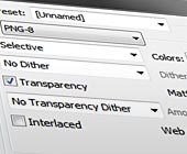
Optimizing JPGs
With JPG, you will mostly just be dealing with an image quality slider bar that goes from 0% to 100%. Or your program may have presets such as Low, Medium, High, and Max. I use the Photoshop "Save for Web" dialog, which gives quality from 0% to 100% as well as some other settings.
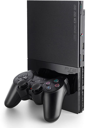
The image that I am going to use as an example is the PlayStation 2:
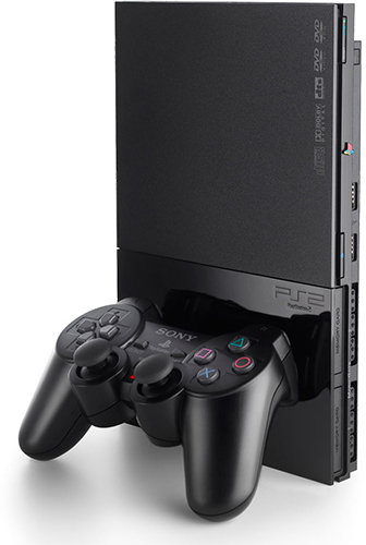
The above image is saved using 100% JPG quality. The initial image was from the web and was significantly larger in resolution, so the original JPG compression shouldn't be an issue for the purposes of this guide.
The first thing to note is that at 100% quality, the file size is 65.4 KB, which is quite excessive. But had I saved it using PNG-24, it would have been 119.1 KB. The complexity of the colors, combined with no solid color areas (other than the white background) makes PNG a very bad choice for an image like this. PNG-8 at 256 colors is a little more reasonable at 70.4 KB, but there is some loss of colors as the image uses significantly more than 256. Both of these are demolished once you choose a reasonable quality level for JPG, as you'll soon see.
Your goal is to find the right balance between quality and file size. That balance will probably be somewhere between 40% and 75%, and can really vary. The first thing I do is zoom in to 200%, so I can see the image a little better, but not too close. Sit back and try not to focus on the details too much. Remember that visitors to your site generally will only be glancing at the photos (unless they are coming specifically to see high-quality photos). Then I just start trying the different quality levels and seeing how they look in the preview. Jumping back and forth between lower and higher qualities until I narrow in on a quality that is a good balance.
At 40%, the image looks decent, but the controller buttons and red light are really washed out. At 13 KB it is a great file size though, so if your visitors aren't too critical you may be fine with this:

At 75%, the image looks really good but the file size is quite large (30.2 KB). I found 60% to be a good balance if you want the details of the image to still be good. Before settling on 60% though, I tested out a few quality levels near it. It turns out that 59% is 1.4 KB smaller than 60%, with no noticeable overall quality change. The JPG compression format is strange like that, so be sure to go 1% by 1% to extract every last bit of file size savings you can.
Here is the image at 59% JPG quality, which ended up being 19.2 KB:
Final Thoughts
If possible, optimize every image your website uses, and at the very least optimize the component images that your layout uses. Beyond just optimizing the images, you'll want to build the web design from the ground up with image file size in mind. Often times you can tile background images and get a lot of visual niceness for very few bytes. This is a topic for another day though.