Archive
This post is archived and may contain outdated information. It has been set to 'noindex' and should stop showing up in search results.
This post is archived and may contain outdated information. It has been set to 'noindex' and should stop showing up in search results.
Effective Text Anchor Link Style for Web Design
Feb 26, 2012Web DevelopmentComments (0)
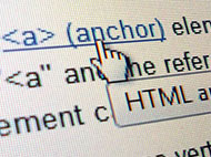 The style of a text link on a web page (hyperlink) should do two things effectively. It should clearly distinguish the link from normal text, so that users can see it at a glance, and it should create a clear hover effect, so users know when their mouse is hovering over it and that a click will activate the link.
The default link style in most browsers is blue with an underline. There is usually no default hover effect, other than the mouse pointer turning into a hand. The blue color and underline are widely recognized as links, so when designing your links you will want to keep that in mind. You don't have to stick to these conventions, but you can design very intuitive links by building off of them.
Color and Underline
The first element of styling a link is the color of the link. The color should contrast with the normal body text, so that users can easily distinguish the links. I've seen some websites that use the same link color as the normal body text color, with just an underline distinguishing it. This makes it difficult to see the links at a glance, and is not a good style.
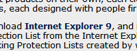
Take a look at these 6 very popular websites and the style of links they use (screenshots are from Windows 7 and Firefox):
Wikipedia Article
Google Blog
Yahoo News Article
Microsoft Blog
Facebook
YouTube
The first thing you'll notice is that they are all variations on the default blue color. As I said above, you can build very intuitive links by building off the default blue link style, and that is exactly what the designers of these high-level websites have done.
Next you'll notice that most have chosen to remove the default underline. This gives the links a cleaner look, allowing them to flow with the body text better, but still standing out due to the color contrast. Whether or not you should leave underlines in your design will be a matter of taste, but you should try it both ways and use the way that flows best with your design.
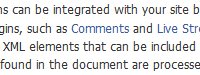
Now that you've looked at the links, I want you to take a quick look at the font size, spacing, and line height. If you haven't yet, read my article on effective text spacing for web design, which covers these topics. In summary, the Google, YouTube, and Microsoft text blocks have default line height, which makes the text look very crowded. The Wikipedia, Yahoo, and Facebook text blocks give the text room to breathe with a larger line height. This makes them easier to read.
Bolding, Size, and Other Styles
The Microsoft Blog link above employs a bold style for its links, which makes it stand apart from the regular body text. Increasing the font size by one or two can also make it stand apart in a similar fashion. Depending on the ratio of links to text in a paragraph, doing this can make the body of text look jumbled or confusing. For example, a Wikipedia Article would probably look pretty crowded if the links (which there is a high ratio of) were all bold. Using Chrome's developer tools, I edited the CSS of a Wikipedia article to demonstrate this:
Normal Wikipedia Article
Wikipedia Article with Bold Links
The Wikipedia article with bold links looks more cluttered than the normal style, due to the high ratio of links to regular text. So while bolding links may put more visual weight on them, when you have too many links, it can lead to problems.
Other styles that aren't used as often but you may want to consider are: Italics, padding, and thumbnails. Italics can add a small extra bit of visual differentiation to a link. Though use them with caution, since on non-smoothed fonts displays it can make the link more difficult to read.
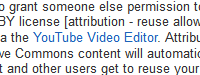
Padding can be used to create some extra space to the left and right of links, which can make them stand out a bit. You can use this in conjunction with a tiny thumbnail, which works well if you have different types of links that you want users to be aware of (EX: internal and external links).
Hover Effect
The hover effect is the effect that happens when the mouse moves over top of the link. This can involve the link text changing color, boldness, underline, size, or just about any other CSS style. It can also involve the mouse pointer changing. By default, there is no change to the link text, and the mouse pointer changes to a hand.
Many websites, including most of the ones I posted above, use an underline for the hover effect. This builds on the default underline link style, which is intuitive:
Wikipedia Article
A change in color can also work well, as long as the a sufficient contrast is achieved so that the user knows the link is being hovered over:
Newegg
It is generally not a good idea to make the hover affect something that changes the flow of the text at all, such as changing the size, padding, or boldness of a link. This can lead to a rapid on/off link hover effect if the mouse is over the link while it is normal state, but not over it while it is in hover state.
The most common style types to use for your hover effect are underline and color. You don't have to stick to these conventions, but be sure to keep the intuitiveness of your hover effect in mind when experimenting.
Mobile Browsers
A quick note on mobile browsers, including Safari on iOS, Internet Explorer on Windows Phone, and Chrome/Firefox on Android: These browsers generally do not have any way to "realize" a hover effect, since the touchscreen creates actions and not pointing (IE: No mouse cursor to fire a hover effect). This probably won't change how you style your links for traditional computers; however, make sure the intuitiveness of your links does not rely on the hover effect, as it will usually be lost on mobile browsers.